Kate Newby Pilates

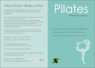
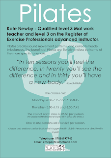
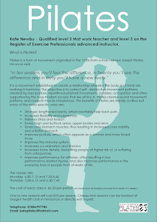
Here are the final posters and leaflets:

it was a bit of a challenge as there was so much information. Talking to the client, i tried to get the information reduced, but she didnt want this. So i produced two posters.

I found it a challenge as it was to be simple, effective and easy on the eye.


Letter press pic.

Here is a nice pic I have found of letterpress. Its a commercial photo but I like it.


Essay time!

We had a tutorial with Anna today about the theory project that I need to do to progress onto the 3rd year of Graphic Design BA.

I am quite nervous about this as I am not the strongest of writers and i feel that I am going to struggle with writing a long essay. I am just happy that it is not dissertation length and that it is only 2500 words. I found I did alright in last years essay, So fingers crossed i will be able to get around the 50 mark.

My title of my essay is :

A Comparative Analysis of Contemporary Brands.

Portfolio Building

As PPRD is coming to a close, I have to get my portfolio sorted out.

I have not really done much to it since the end of last year, but i have alot of things that i need to add. so i need to make a list before I forget:

  1. Greetings Cards
  2. Packaging
  3. Examples of Website (that I dont want to include but have too)
  4. D+AD 
  5. Work Experience
So I need to print out alot and make sure its in some kind of order. I think I am going to put it in chronological order. I feel that this would be most suitable for PPRD

designs for my friend, Miss Kate

My friend Kate is a Pilates Instructor and she needs some help with creating a poster advertising what she does.

Seeing as she is my best friend, i felt that i needed to help her design it.

All she has said is that she would like it to stand out, have info about pilates in it and basically look good. She would like it to be A4, but i am also going to try A3 too.

Inspiration for her poster:


This is not what i want it to look like, but it maybe the best way of advertsing Kate.


Crit about Research

Today we had a crit with Kit about our research that we are doing for our professional project. I found it to be very interesting as the people in the groups had a similkar theme running through so ideas were helpfull for everyone.

here are the points that came up for my research

TARGET AUDIENCE
  • vegitarian
  • vegans
  • allergies
  • questionnaire
RESEARCH INTO NAMES

SYMBOLS SYSTEMS

MORE INITAL RESEARCH

Portfolio Guidence

Today two designer came in from Thinking Juice to give us advice on portfolios and what we should have in them.

  1. Only pieces that are related to the job your after
  2. More more then 8 briefs
  3. Don't overcrowd pages
  4. Box could be better
  5. Have Print objects such as final cards etc
  6. Know what you need to say about each piece
It was really useful to get get outside information on portfolios.

Work Experience

Today at Work experience with d+r the solution Icreated more logo ideas for Comms UK and there sub companies Schools Comms and Surgery Comms

I am still really enjoying work experience. Even though i dont get paid for the 1 day a week i do there i feel that the experience that i do gain is quite priceless. and i am alsways learning and being more professional in my work.

i feel that this has had positive and negative effects on my work. the only negative point i can think of is that i no longer understand the amount of research that we have to do on the course. where as at d+r there is research but no sketchbooks or month long projects.
The positives totally outweigh the negatives as i feel that i have gained knowlege in the programs i use, confidence in my work and a good level of professionalism.

Proposal Hand in for Professional Project

Here is the final Draft for my Proposal. . . .

Field of study
For my professional project I plan on branding a fictional restaurant chain that offers a specialised menu of foods; this will give me the opportunity to explore identity, typography photography and graphic design, which relates to what I would like to do as a career in the future.
My main aim is to create a brand for the company and a range of corporate print designs, such as food and drink menus, receipt books, business cards, and a series of posters for an advertising campaign.

Context
My proposed media is going to be a set of print designs; it will be presented as a collection of corporate prints that works well for the company. This relates to with the work I have completed at work experience in the previous term.
My target audience for this project is broad as the restaurant caters for all ages and occasions. But as the restaurant has a specialised menu this could mean that only a certain audience will eat there. So it is important that the result is viable and appeals to all demographic target audiences. This is something that I am going to have look into while doing my research.
As this is a specialised food restaurant it has a lot more to offer then a regular chain restaurant, such as quality of food and the general experience. I aim to use this to create a unique selling point for the business. Because of this I am going to look at the current food industry to get a in-depth look at healthy living, popular food trends and trends that are yet to make an impact. Areas that are important to my project are Vegetarian, Vegan and Healthy Eating, as I would like to promote a new healthy food range. I feel that this could make the company unique from many of the current food chains that are popular today in our society company, and should be empathised to attract more people to the business.

Method
I plan to start my research by looking at the current food industry to get a further insight of the business and its policies. It is also very important to my research that healthy eating, vegetarian and vegan restaurants are looked at. As I plan to create my own menu I feel that looking at the nutritional values of food and new food ‘fads’, both of which will also be a benefit, this can help me to create a new line of healthy eating. This will then be followed by research into identity, advertising, and commercial design.
I also plan to look at designers and design companies that have exciting and innovative branding projects in their portfolios, such as Why Not Associates and Spin.
From this research I then plan to start my idea generation with everything that I learned backing up my ideas. I will progress onto a final idea that I can explore and expand to make a successful and professional branding and corporate print project.


Fingers crossed its ok!
Spin

I have included them as I am really interested in their work and find it inspirational.

www.spin.co.uk


Here are some examples that i really like from the company called Spin

Expanding ideas

Today we had a group seminar about our ideas.

It started at the beginning of the day and everyone had to get up and present their work in front of the "panel' (Sally, Jo and Mike Ryan) and to the rest of the class. We had a minute to present our work and give everyone a idea of what we were doing for our professional Project.
It was really interesting to hear other peoples ideas and the feedback they got. i was suprised to find that no one had the same idea, and that the range was really wide from book making to experimental self pieces.

For my presentation i showed my research booklet that i have been making with the research of the food industry. I found that this was a good thing to show as it proves that i have been doing research for it already and that i am confident in my proposal.

There were a few things that Mike Ryan bought up:

  1. More research
  2. Competition in the market
  3. Existing and old examples of companies
  4. Relevent logos

2nd Crit on Personal Project Propsal

Today we had group crits in small numbers with Sally or Mike. Our group had Sally which i was happy about as i really trust her judgment and comments in our crits. I was really confident when i went into the crit with sally this afternoon, i had a firm idea on what i was planning to do.

Sally said that i could do better the idea that i proposed.

Time to rethink and try and make it stronger.
  • What type of restaurants most popular
  • What about allergies and Intolerance's
  • DON"T do the Boatshed Re-Brand
  • What makes food organic
  • Enviromental issues
With all of this i think that after some research i will be able to make a strnger proposal.

Crit on Personal Project Propsal

Today we had a quick crit with Neil about our initial ideas for our learning proposal.

Here was (was being the key word here) first idea:

To re brand the Boatshed Cafe In Penzance and create a series of commercial print items such as menus, posters and logo.

It was agreed on that that idea did not have enough depth, and that I could do better.

here are some more ideas to add to the 'pot'

  1. Make a book
  2. Create a experimental self promotion piece.
  3. Enviromental issues
  4. Create new brand for something in the future
I am hoping that from this is i will be able to create something better then the first idea and something that i find stimulating and a bit of a challenge.

Ideas for Proposal

Ideas for Proposal:

The Boatshed:

To re brand the boatshed. As it is going to have a make over this summer anyway.

Here are some pictures of the boatshed. . .


Professional Project 2009

So here is is,

Our final project of Visual Communication....

We got given the brief today, and i have t say that everyone is really excited, buzzing almost!

I have an idea of what i want to do, but i have been keeping my mind blank from thinking of a final outcome. i think it will hinder my design and research if i do that.

we have alot of tutorials and seminars to help us with our proposal, so it is going to be exciting this week!

:)

Screen Based Communication 2 Evaluation

This project was challenge for me. I found the software hard to use as I did not fully understand how to use it. I feel that the work shops that we had were very useful and I feel that I have learnt from them.

Overall I am disappointed with my outcome for my webpage. It did not come out how I expected it to and I feel that I have let myself down. 

I had great plans for this project and I had a clear idea of what I wanted it to look like. I think that this could have been my downfall as maybe I had too higher expectations of what I wanted. As I could not get to where I wanted I started to care less about this project. I found it frustrating not to be able to do what I planned and found my motivation for this disappearing. 

Once I got over that I would not be able to having it looking like I wanted I started to use dreamweaver more. After a while I learnt the basics and made the website. I feel that my website was basic and not very flashy. 

Looking at other peoples sites I feel that I could have trued harder and done some more research into CSS and action script to make the site more interesting. If I could do this project again I would do what I wanted from the beginning and tried harder to achieve 
 a better website.

Website deadline

O how I hate web design.

The deadline is today and i have to say that i am so happy that this project is over. i really did not like this project. 

I have had so many problems and issues that it just hasn't seemed worth it. 

BUT

I have learnt the basics and could navigate dreamweaver if i had to, which i hope is never again!

Lets hope i have passed :s

Lightbox

I have decided that i am going to use lightbox for my website.

the reasons being that i think it is a good way of having a gallery and that it looks quite professional.

Here is the link for the lightbox script that i am planning to use.


enjoy

Website Problems

I have been having problems with my designs for my website.

I had this big idea in my head about what I wanted to to now it seems that I have left it too late and that I should have planned it earlier.

What I originally wanted from this was a really good looking website, but I'm disappointed with what I have been able to achieve. 

I wanted to have a really cool image in the background of me sitting in a garden with my back to the camera and a big cotton sheet in the main section of the image. this was going to be my background and "blank" area for images and type.

I got told that this wasnt a good ides from someone close to me. 

I wish I had not listen to them

2009! Happy New year

Happy New Year Everybody.

Over Christmas i worked a lot, I didn't go home until Christmas Day Evening. and only stayed in cornwall for 3 days before i came back to work some more and make some money.

As for uni work......I have been quite slack to be honest.

All the things i said i was going to do, but i didnt....


OPPS